

Logos & Brand Assets
Upload the light logo, dark logo, compressed logo, and favicon that carry your brand across the platform.
Logos & Brand Assets
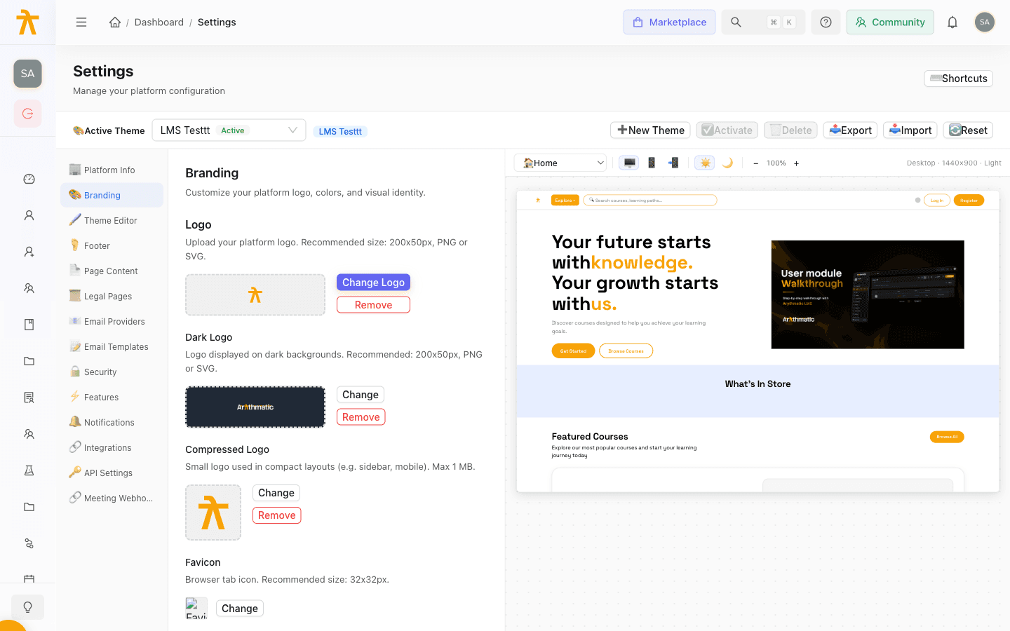
Your logos and favicon are the first thing learners see, so Arythmatic lets you upload a distinct asset for every place your brand appears. The Branding section under Settings holds four separate logo slots — light logo, dark logo, compressed logo, and favicon — each sized for a different surface, alongside a hero image, a community link and button, and custom CSS. Each image is uploaded and saved the moment you select a file: it is stored on your active theme and served from a CloudFront URL right away, so there is no separate publish step for logos or the favicon.
Before you begin
Prepare artwork on transparent backgrounds so each logo sits cleanly on any surface. SVG scales best; PNG and WebP are good fallbacks. You need a role with permission to edit workspace settings to see the Branding section — see Roles & Permissions.
The four brand assets
Each slot targets a specific context. The table below maps each asset to what it does and where it shows up.
| Asset | On-screen label | Recommended size | Accepted formats | Where it appears |
|---|---|---|---|---|
| Light logo | Logo | 200x50px | PNG, JPG, SVG, WebP | Default logo on light backgrounds |
| Dark logo | Dark Logo | 200x50px | PNG, JPG, SVG, WebP | Logo shown on dark backgrounds and dark mode |
| Compressed logo | Compressed Logo | Small mark (max 1 MB) | PNG, SVG, WebP, ICO | Compact layouts such as the sidebar and mobile |
| Favicon | Favicon | 32x32px | PNG, ICO, SVG, WebP | The browser tab icon |
Upload the light logo
The light logo is your primary mark, shown on standard light backgrounds.
- Open Settings and select the Branding section.
- In the Logo section, click Upload Logo (the button reads Change Logo once one exists).
- Choose a PNG, JPG, SVG, or WebP file. It uploads and saves to your theme as soon as you select it, and the preview updates immediately.
Clicking Remove next to the preview clears the logo from the on-screen preview, but that removal is not yet persisted — the previous logo reappears after you reload. To swap a mark, upload a new file instead.
Upload the dark logo
The dark logo appears wherever the interface uses a dark background, so a light or white-knockout version usually works best here.
- In the Dark Logo subsection, click Upload (or Change to replace it).
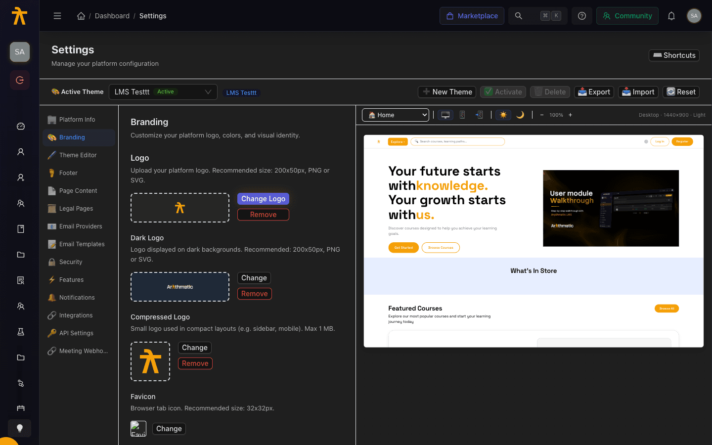
- Select a PNG, JPG, SVG, or WebP file. It saves to your theme on selection, and the preview renders against a dark swatch so you can confirm contrast.
Removing the dark logo on-screen is not persisted today, so upload a replacement rather than relying on Remove to fall back to the light logo on dark surfaces.
Upload the compressed logo
The compressed logo is a small mark for tight spaces — think the collapsed sidebar or a mobile header — where the full wordmark would not fit.
- In the Compressed Logo subsection, click Upload (or Change).
- Choose a PNG, SVG, WebP, or ICO file up to 1 MB. It saves to your theme as soon as you select it.
Upload the favicon
The favicon is the tiny icon shown in the browser tab and bookmarks.
- In the Favicon subsection, click Upload (or Change).
- Select a PNG, ICO, SVG, or WebP file sized around 32x32px. It saves to your theme on selection.
How saving works
Logo and favicon uploads are saved the instant you select a file — each one is stored on your active theme and served from a CloudFront URL immediately, with no separate publish step to click.
The Save Changes and Reset buttons at the bottom of the Branding section apply only to the other fields here — the community link and button text and the brand colors — not to the logo or favicon images. That also means clearing an image with Remove is not written back by Save Changes, so a removed mark reappears on reload.
The primary and secondary brand colors can be edited in two places: here in the Branding section and, per light/dark variant, in the Theme Editor. Saving from the Branding section writes only the light variant (light.colors.primary and secondary) — it does not touch the dark-mode accent or any other color group. To set the dark-mode accent, or any background, text, or border color, use the Theme Editor, which edits both variants and all color groups.
