

Course Analytics
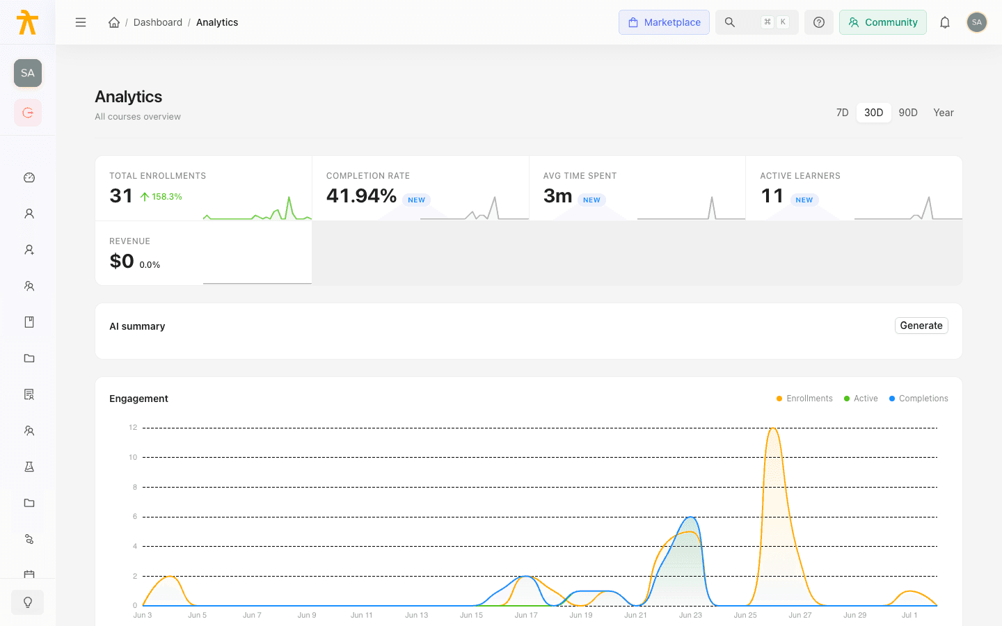
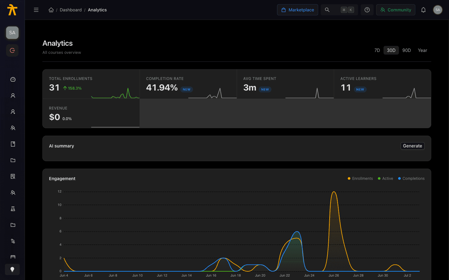
Read the analytics landing page — metric tiles, date-range control, and trend deltas — to see how your whole catalog is performing at a glance.
Course Analytics
The Analytics page is your all-courses overview: a single dashboard that rolls up enrollments, completion, learning time, active learners, and revenue across every course in your workspace. A row of metric tiles gives you the headline numbers with trend indicators, and a date-range control lets you scope everything to the last 7 days, 30 days, 90 days, or the past year. Use it as your starting point, then click into any course for a deeper drill-down.
Choosing a date range
At the top right of the header is a segmented control that scopes every metric, chart, and table on the page. The options are:
| Control | Window |
|---|---|
| 7D | Last 7 days |
| 30D | Last 30 days (default) |
| 90D | Last 90 days |
| Year | Last 12 months |
Selecting a range refetches the overview for that window. Trend deltas and sparklines are calculated by comparing the selected window to the immediately preceding one of the same length, so switching ranges also changes what "up" and "down" mean on each tile.
The page loads on the 30D window by default. If a metric looks unexpectedly flat or empty, widen the range — a brand-new course may simply not have enough activity in the last 7 days.
Analytics numbers are a cached snapshot, not a live feed. The overview and per-course detail are cached per workspace and range for up to 10 minutes, so a just-completed enrollment, completion, or payment may not appear on the tiles right away — that is expected, not a bug. Reloading the same range serves the cached copy until it expires.
Reading the metric tiles
The tile row summarizes the whole catalog for the selected range. Each tile shows a headline value, a trend delta, and a small sparkline of the underlying trend.
| Tile | What it measures |
|---|---|
| Total Enrollments | Total number of enrollments across all courses in the window. |
| Completion Rate | Share of enrollments that reached completion, shown as a percentage. |
| Avg Time Spent | Average learning time, formatted as minutes, hours, or days (for example 2h 15m). |
| Active Learners | Distinct learners with activity in the window. |
| Revenue | Total attributed revenue, formatted compactly (for example $1.2k or $3.4M). |
The Revenue tile only appears when your workspace has revenue data to report. If you don't sell courses or haven't captured any transactions yet, the row shows four tiles instead of five. See Monetization for how course pricing feeds this number.
If you sell in more than one currency, treat the Revenue tile and the per-course revenue column as approximate. The backend sums completed transactions by raw amount without normalizing currencies, and conversion happens in the browser. For a currency-accurate breakdown, use Payment Analytics, which reports intake per real currency.
Trend deltas
To the right of each tile's value is a change indicator that compares the current window to the previous one:
- An up arrow in green means the metric grew versus the prior period.
- A down arrow in red means it declined.
- A new badge appears when there was no baseline in the prior window — for example, a metric that had zero activity before and now has data. Treat new as "first-time data," not as a percentage change.
The percentage next to the arrow is the absolute change, rounded to one decimal. Below the value, a sparkline traces the metric's movement across the window and is tinted green or red to match the direction of travel.
A delta always reflects the previous window of the same length, not a fixed calendar period. Comparing a 7D delta directly against a 90D delta is misleading — line up the ranges before drawing conclusions.
What else is on the page
Below the tiles, the overview continues with several sections that use the same date range:
- AI summary — an on-demand written readout of the current metrics. Click Generate to produce it, or Regenerate to refresh; a cached tag indicates a reused result. Changing the date range clears the previous summary.
- Engagement — a trend chart layering enrollments, active learners, and completions over time.
- Geographic distribution — enrollments by country for the period, viewable as a Chart or a Map. If learner locations haven't been captured yet, this section stays empty.
- Courses — a per-course breakdown table (course, enrolled, completion, average time) that you can export with the CSV button. Click any row to open that course's detail view.
- Funnel — stage-by-stage progression from enrolled through completed, with an overall drop-off badge.
- Where are learners right now? — a distribution of learners across course progress stages.
The Courses table is your jumping-off point for a single course. Clicking a row opens the per-course drill-down, and the CSV export includes extra columns (active learners, module engagement) that aren't shown in the on-screen table.
The Courses table only lists courses that had at least one enrollment in the selected window. A course you know exists can drop off the table entirely when you narrow to 7D — it isn't lost data. Widen the range to bring low-activity courses back into the list.
Who can see this page
The Analytics page is restricted to Administrators (workspace Admin role). Instructors and learners cannot open it. Review your role setup on the Roles & Permissions page if a team member can't reach it.
