

Analytics Deep Dive
Read every chart tile on a single course's detail view — from the completion funnel to the geography and study-time heatmaps.
Analytics Deep Dive
The course detail view zooms in on one course and lays out its full performance story across a stack of chart tiles. Each tile answers a different question: how many people made it through, where they drop off, how far along they are right now, and when and where they study. This page walks through every tile so you can read them confidently and act on what they show.
Opening the detail view
- Go to Analytics in the dashboard sidebar.
- Click any course to open its detail view.
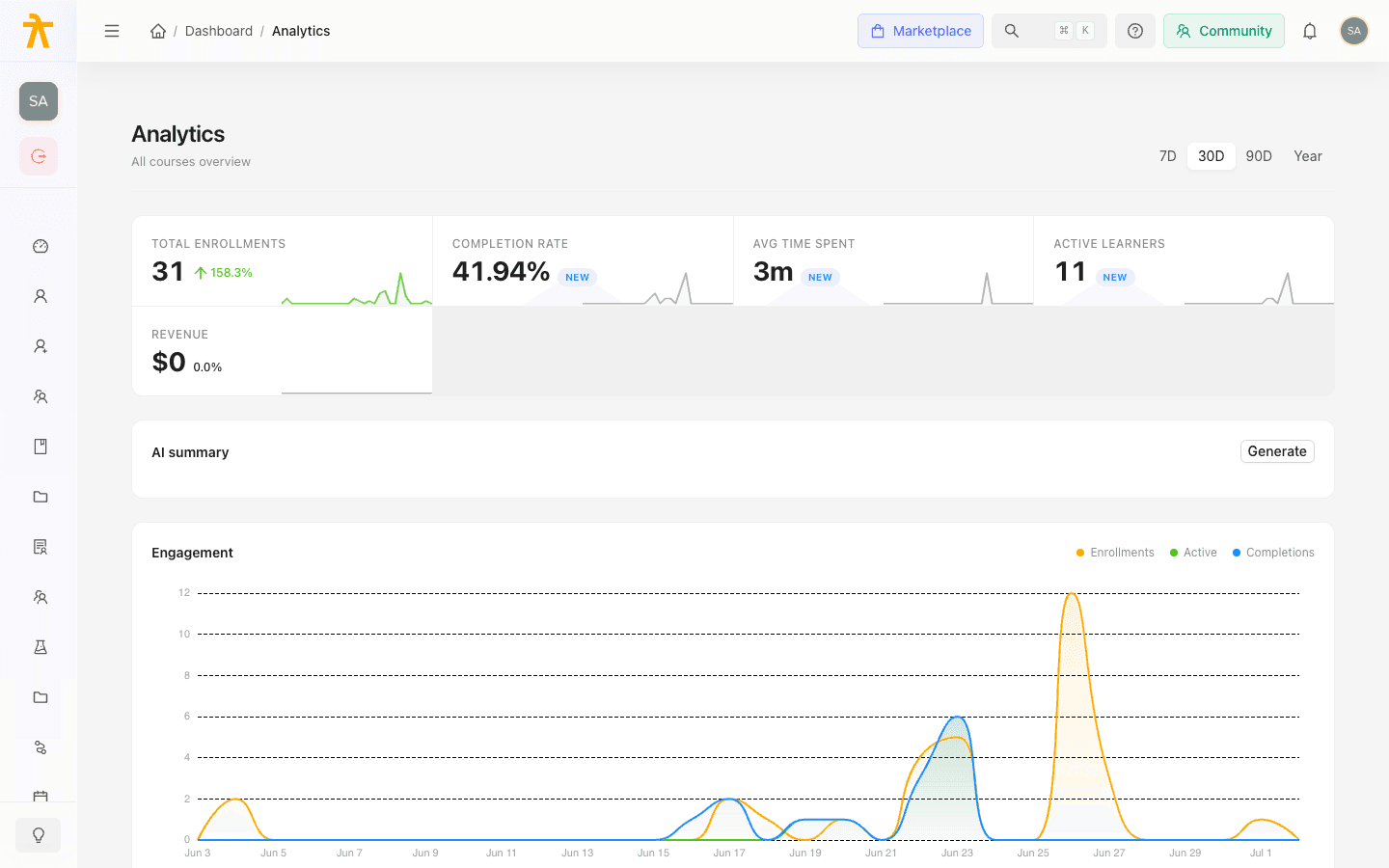
- Use the 7D / 30D / 90D / Year range selector in the top right to change the reporting window. Every tile below re-queries when you switch ranges.
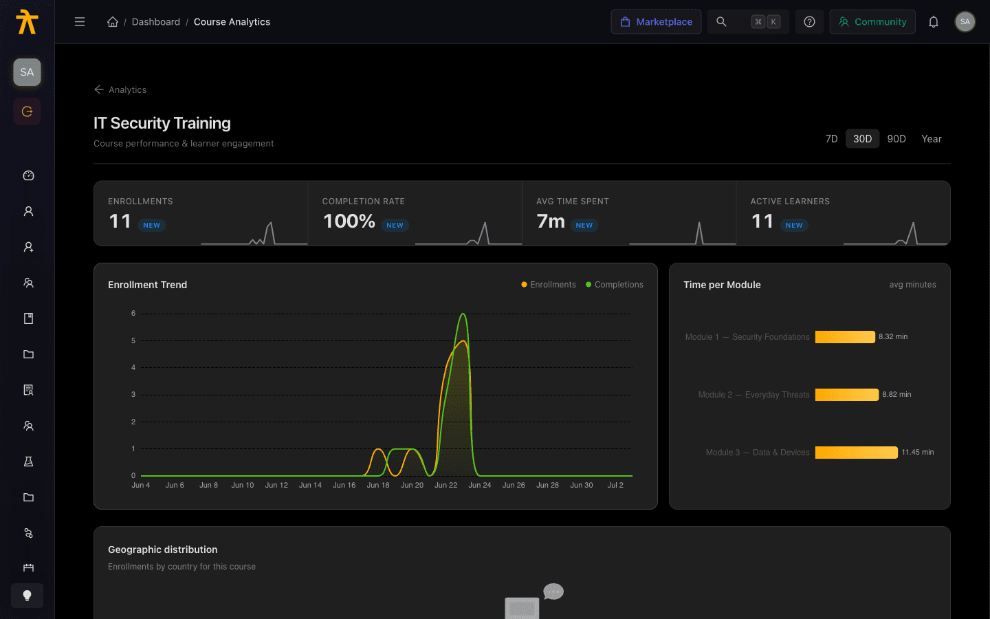
The header shows the course title and a Course performance & learner engagement subtitle. Use the Analytics back link at the top left to return to the overview.
The KPI row
Four metric tiles run across the top, each with its value and a period-over-period delta arrow:
| Tile | What it measures |
|---|---|
| Enrollments | Total learners enrolled in the selected window. |
| Completion Rate | Percentage of enrolled learners who finished (shown with a % suffix). |
| Avg Time Spent | Average time in the course, formatted as Xh Ym (or Xd Yh for long courses). |
| Active Learners | Learners active in the window. |
The delta on each KPI compares the selected range against the previous equivalent period, so switching from 30D to 90D changes both the value and the trend arrow.
Enrollment Trend and Time per Module
The first chart row pairs two views:
- Enrollment Trend is a smoothed area chart with two series — Enrollments (amber) and Completions (green) — plotted over the selected window. The gap between the two lines is your in-progress backlog: a widening gap means people are enrolling faster than they finish.
- Time per Module is a horizontal bar chart of average minutes spent per module. Long bars flag modules that either carry the most content or are causing learners to slow down.
Geographic distribution
This tile maps enrollments by country and has a Chart / Map toggle in its header.
- Chart view is a horizontal bar ranking countries by enrollment count, with each bar labeled by count and its tooltip showing the share of the chart total.
- Map view plots a world map with a bubble on each country; bubble size scales with enrollment (by area, using a square-root radius so large countries do not overwhelm the view). Hover a bubble for the country's enrollment count and percentage of total. You can pan and zoom the map.
If no locations have been captured, the tile shows "Geographic data isn't tracked yet" instead of a chart. Country data only appears once learner locations are recorded.
Module Completion and the Learner Funnel
The next row shows where progress stalls.
- Module Completion lists each module with a completion percentage, a colored progress bar (green at 75%+, amber at 50–74%, red below 50%), the average minutes spent, and a drop-off figure. Scan the red bars first — those are your weakest modules.
- Learner Funnel renders the stages of the course as a horizontal funnel, widest stage on top. The header badge shows the overall drop-off — computed as the fall from the first stage to the last. Each bar's tooltip gives its count and its percentage of the top stage, so you can pinpoint exactly which step loses the most learners.
The funnel's stages are progress bands, not your actual course modules or quizzes. They come from fixed progress-percentage cutoffs applied to each enrollment:
| Stage | How a learner qualifies |
|---|---|
| Enrolled | Everyone enrolled in the window. |
| Started | Progress above 0%, or status in-progress/completed. |
| Module 1 | Progress of 10% or more. |
| Halfway | Progress of 50% or more. |
| Assessment | Progress of 80% or more. |
| Completed | Status is completed. |
Labels like Module 1 and Assessment are generic progress bands, not links to specific course content. A learner at 55% counts toward Halfway but not Assessment regardless of which lessons or quizzes they actually finished. Each stage is also clamped so it can never be larger than the stage above it, keeping the funnel from widening.
Reading a funnel
- Start at the top (widest) bar — that is your entry population.
- Follow each stage down; a sharp narrowing between two adjacent bars is a friction point.
- Compare the last bar to the first — that ratio is the headline drop-off shown in the badge.
Where are learners right now?
The Where are learners right now? tile is a progress-distribution bar chart. Each bar is a progress bucket (for example 0%, 20%, 40% … completed) and its height is the number of learners currently sitting in that band. A tall bar early in the range means many learners have started but not progressed; a tall bar at the far right means many are near completion.
Use this alongside the funnel: the funnel shows how many were lost, while this tile shows where the survivors are stuck right now — the actionable place to send a nudge or reminder.
When do learners study each module?
The heatmap answers timing. Modules run down the vertical axis, day of week runs across the horizontal axis, and each cell's color intensity is the average minutes spent — darker amber means more time. The legend at the bottom maps color to minutes, and hovering a cell shows the exact module, day, and average time.
Read it two ways: scan a row to see which days a given module gets attention, or scan a column to see which modules dominate a particular day. Empty or pale grids mean there is not yet enough activity data to render the pattern.
